Planning
The UP Sí Vale UX team needed to evaluate the new redesign experience, seeking to find and document pain points, growth areas and new opportunities.
We also wanted to understand user behavior with the new features and improvements implemented in the design launch on app stores.
What did we want to know?
- Does the user understand the brand features?
- Can users complete a digital purchase?
- Will we get different solutions from feedback?
Participant profile
- 3 men and 3 women, cardholders
- Medium / high technology level
- Familiar with the app
Hypotheses
✦ Users will know where they can spend their money
✦ The promo section will be a valuable and useful addition
⚠ Users might get stuck on online purchases
✦ Users will be satisfied with "Report card" and "Block card"

Tasks for users
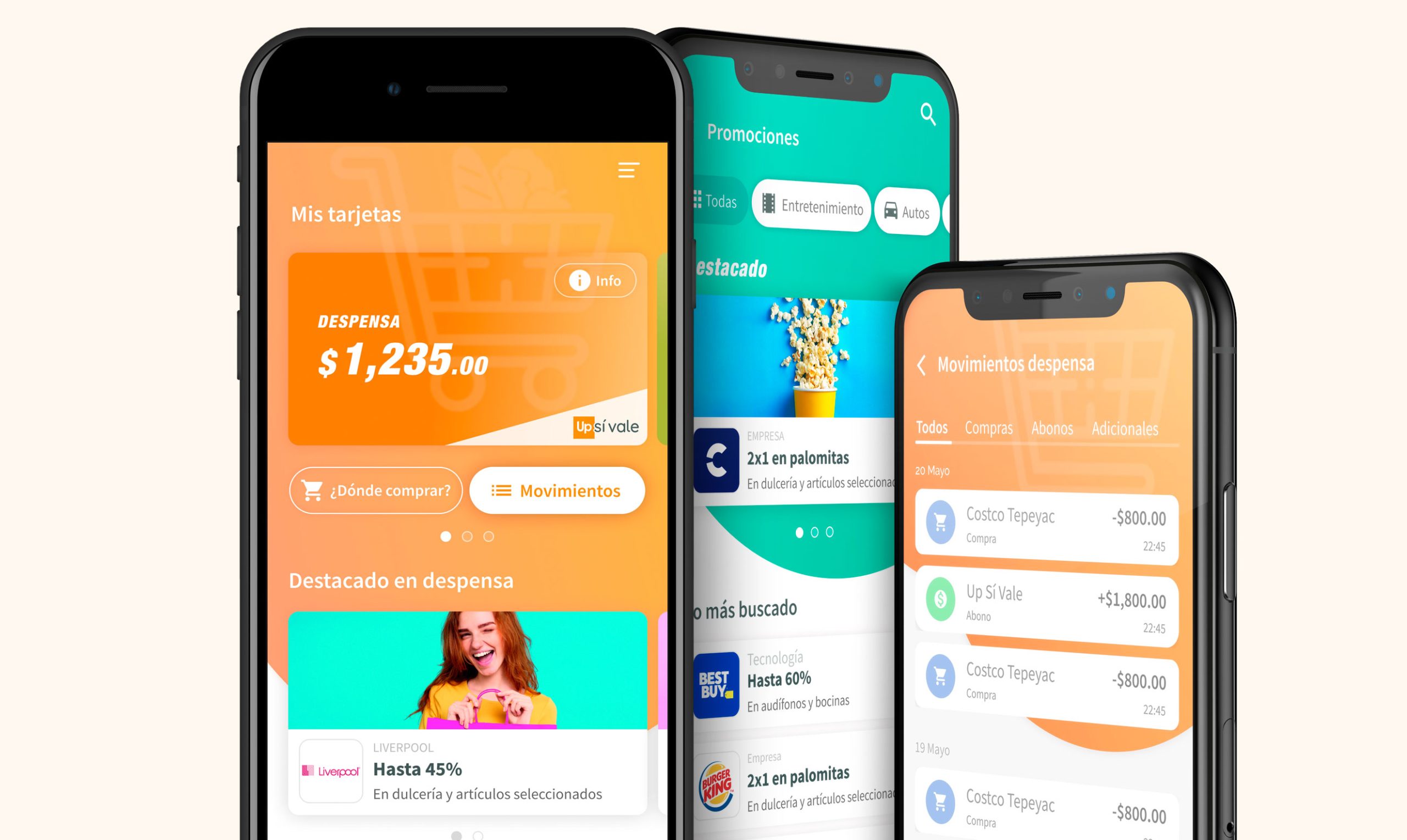
Basic flows
- Complete onboarding
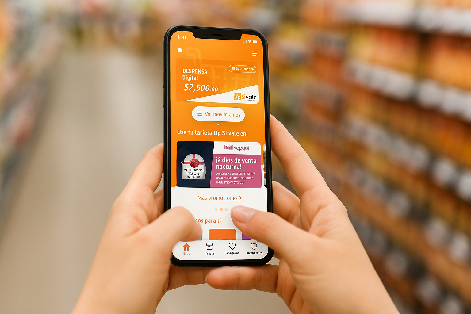
- Add grocery card
- Check card balance
- Review recent transactions
New features
- Report unknown charge
- View and interact with promos
- Make a digital purchase
- Block card
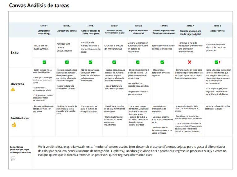
Observation canvas (research documentation)
Findings
✦ Positive findings
- Intuitive and easy interface
- Standard code-by-email (everyone knew the process)
- Good CVV management dynamics, perceived as very secure
- Home interaction is clear
- Edge on other cards helps understand there is more lateral navigation
- Button well placed, good contrast, clear text
- Good that it has the report option
- Dynamic CVV for security very well received
⚠ Areas for improvement
- Buttons are confusing — not clear if they are inactive
- Too much text on the welcome screen
- Improve code validation (via WhatsApp or SMS)
- Some accessibility issues with small numbers
- Confusion about why it changes color from white to orange
- On some devices the user must scroll to see the main info
- Some users misinterpret the navigation arrow
Testing impact
The usability testing findings directly informed the next design iteration — prioritizing accessibility fixes, welcome screen simplification and improvement of the code validation system.
6
Real users in remote sessions
8
Tasks evaluated per user
↑
Iterations informed by real data