The problem
The app only showed balance, transactions and a benefits section with no segmentation. Users didn't know where to spend their money and many accumulated electronic balance without spending it.
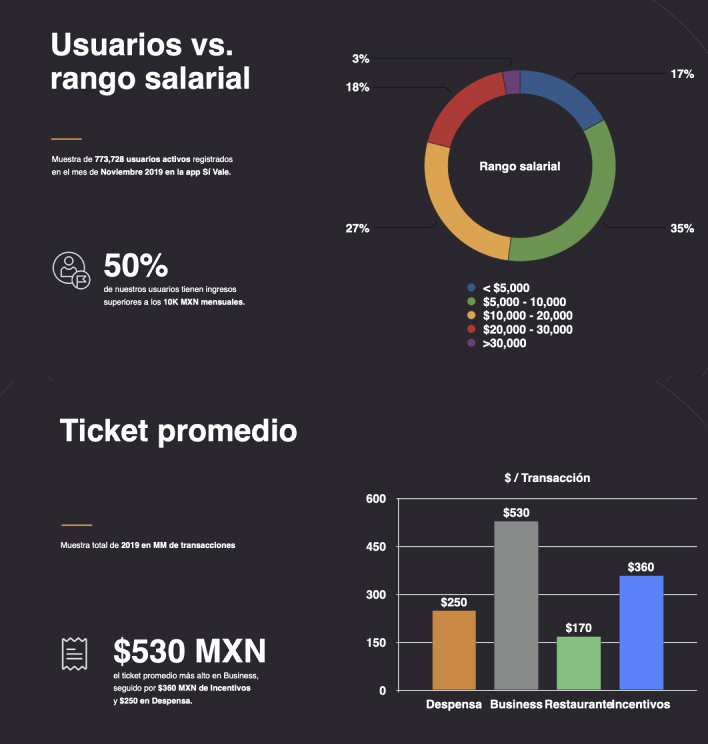
We had over 1 million potential users with wasted interactions — people only opened the app to check if their company had deposited their monthly payment.

Research process
We followed a structured 5-phase process to ensure every design decision was backed by real user data.
Planning
- Define project objectives
- Select methods based on budget
- Recruit participants
Research
- User interviews
- Identify behavioral patterns
- Map pain points
Synthesis
- Create personas and journey maps
- Define problem statements
- Translate findings into recommendations
Design & Testing
- Design Thinking + sprints
- High-fidelity prototyping
- Usability testing with defined tasks
Entrevistas con usuarios
During the ideation phase I conducted user interviews to build new personas and inform the design. The team prepared a script with 18 open-ended questions focused on values, motivations and routines of our target audiences.
In 7 days we recruited and interviewed 12 users remotely. Some key questions:
- Do they know where to spend their money?
- How often do they open the UP Sí Vale app?
- Do they have a monthly spending average?
Problem statements
Statement 1
Unused cards due to lack of information — users don't know where to spend their money even though they have the app.
Statement 2
Monthly balance check — inform users where they can use their cards.
Statement 3
Nobody knows about digital purchases — in partnership with Mastercard, users can make online purchases but don't know it.
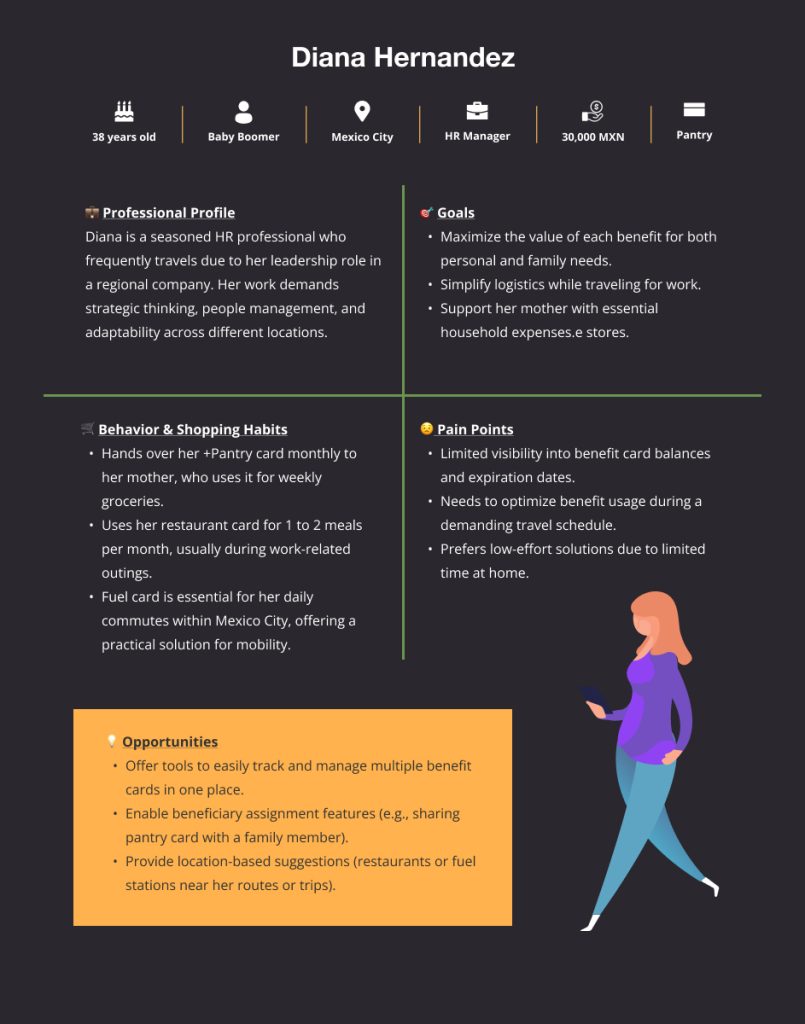
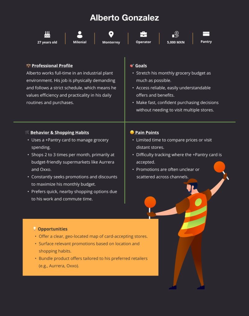
Personas creation
We built personas based on interview findings to keep the team user-focused throughout the design process.
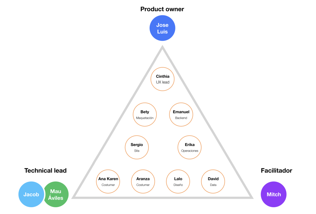
Team organization
We organized different departments to stay aligned with a solid strategy that considered all perspectives.
Teams involved
- Marketing
- Ventas
- Partnerships
- Technical support
- Desarrollo
- User Experience
Objetivo
Increase the app's value for the million users we already had, showing them where they can use their cards and generating profitable spaces for the business.
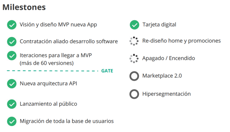
UI Design process
Phase 1
- Card sorting for organization
- Ideation, interactions and sections
- User flows and flow maps
Phase 2
- Low resolution wireframe
- Stakeholder feedback
- High resolution wireframe
Phase 3
- High resolution prototype for user testing
- Development handoff
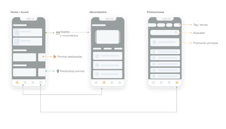
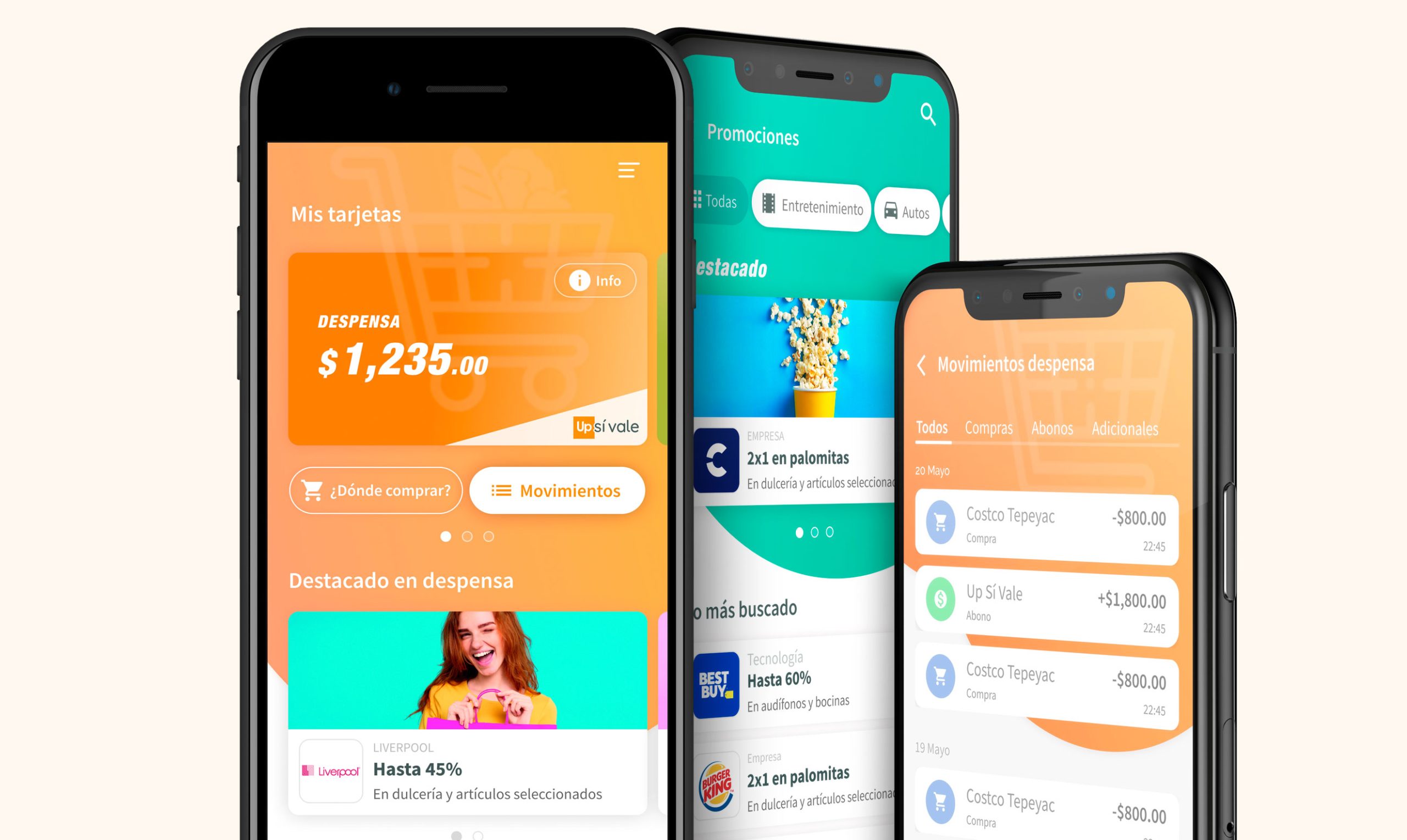
Low resolution wireframe

Flow screens in Figma

Final approved screens