LATAM Slide Library
& Style Guide
A volunteer collaboration with Publicis Sapient's LATAM team to redesign their monthly all-hands experience — from monotonous slides to a vibrant, culturally-grounded component library.
A volunteer collaboration with Publicis Sapient's LATAM team to redesign their monthly all-hands experience — from monotonous slides to a vibrant, culturally-grounded component library.
Publicis Sapient holds monthly meetings with their LATAM team — spaces designed to step away from day-to-day work, catch up on company news, and connect as a group. They typically started with an interactive dynamic to ease into the mood, followed by updates on evaluations, holidays, new hires, and other team-wide topics. The tone was always clear, transparent, and friendly.
After an internal survey, a pattern emerged: the team was starting to feel a sense of monotony around these meetings. Attendance began to drop. The sessions that were meant to bring people together were slowly losing their pull.
The answer wasn't to change the format — it was to refresh the experience.
This was a collaborative, volunteer-driven project. Here's where I stepped in:
I started by exploring several visual directions, each tested across real use cases — title slides, content layouts, interactive dynamics, and announcement formats. After a feedback round, the team aligned on one final direction that felt fresh, on-brand, and flexible enough to evolve.
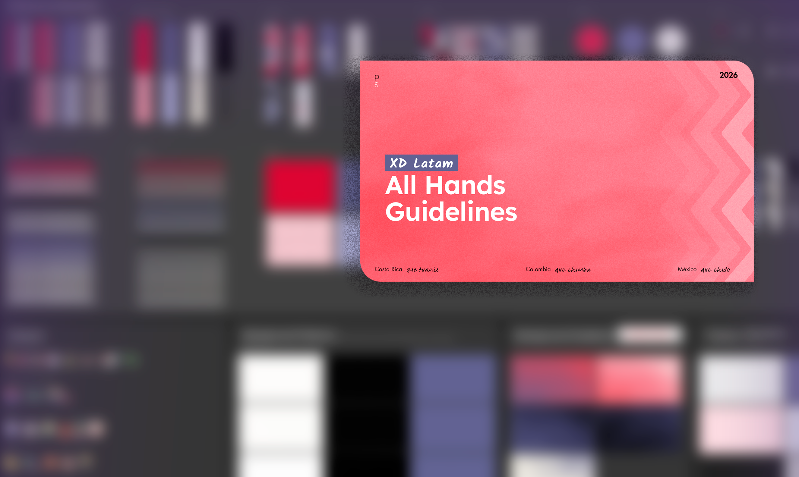
Three visual directions explored — one selected by the team through feedback
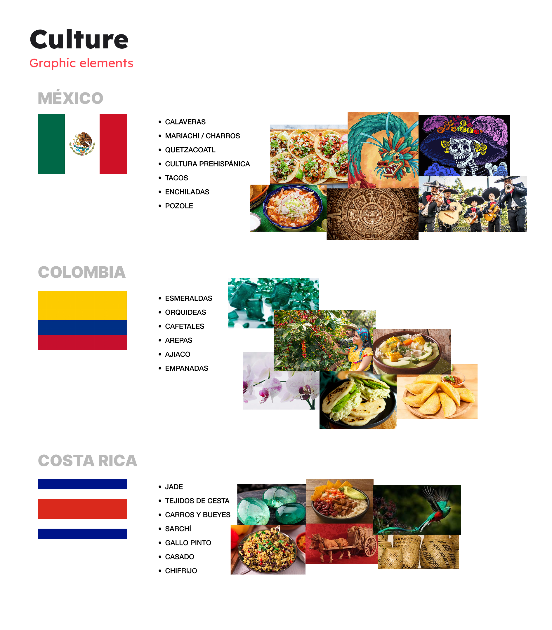
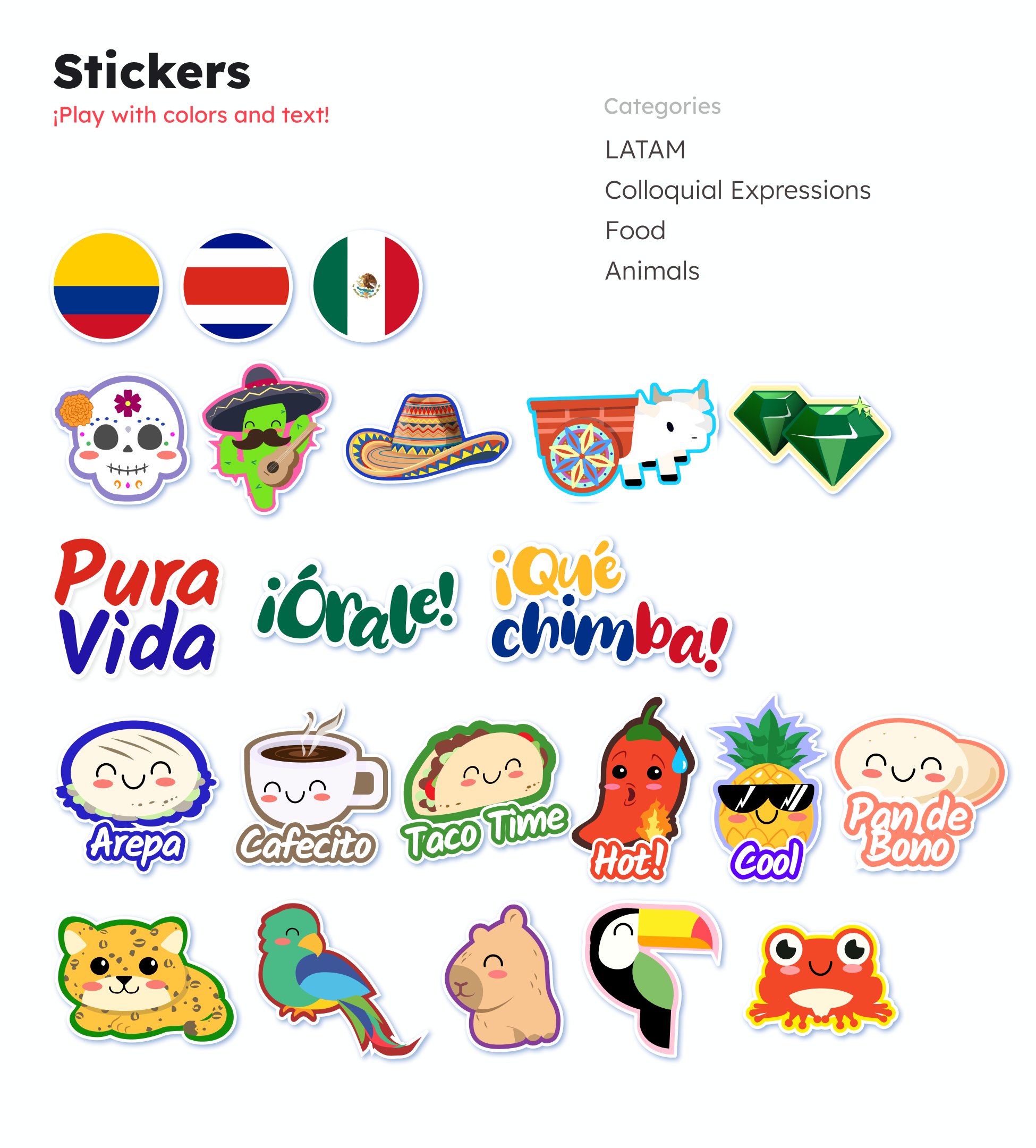
One of the most meaningful parts of the project was grounding the visual assets in the real cultures represented across the LATAM team. We researched visual references, symbols, everyday objects, and traditions from Mexico, Costa Rica, and Colombia — then translated those findings into a set of vector stickers.
Rich visual references rooted in everyday culture: street food, textiles, architecture, and popular traditions.
Nature-forward imagery: biodiversity, color, iconic fauna, and the warmth of the country's identity.
Vibrant colors, craftsmanship, and cultural pride — from coffee culture to artisanal patterns.
Each sticker was built with variants — fully editable in text, color, and size for maximum flexibility.
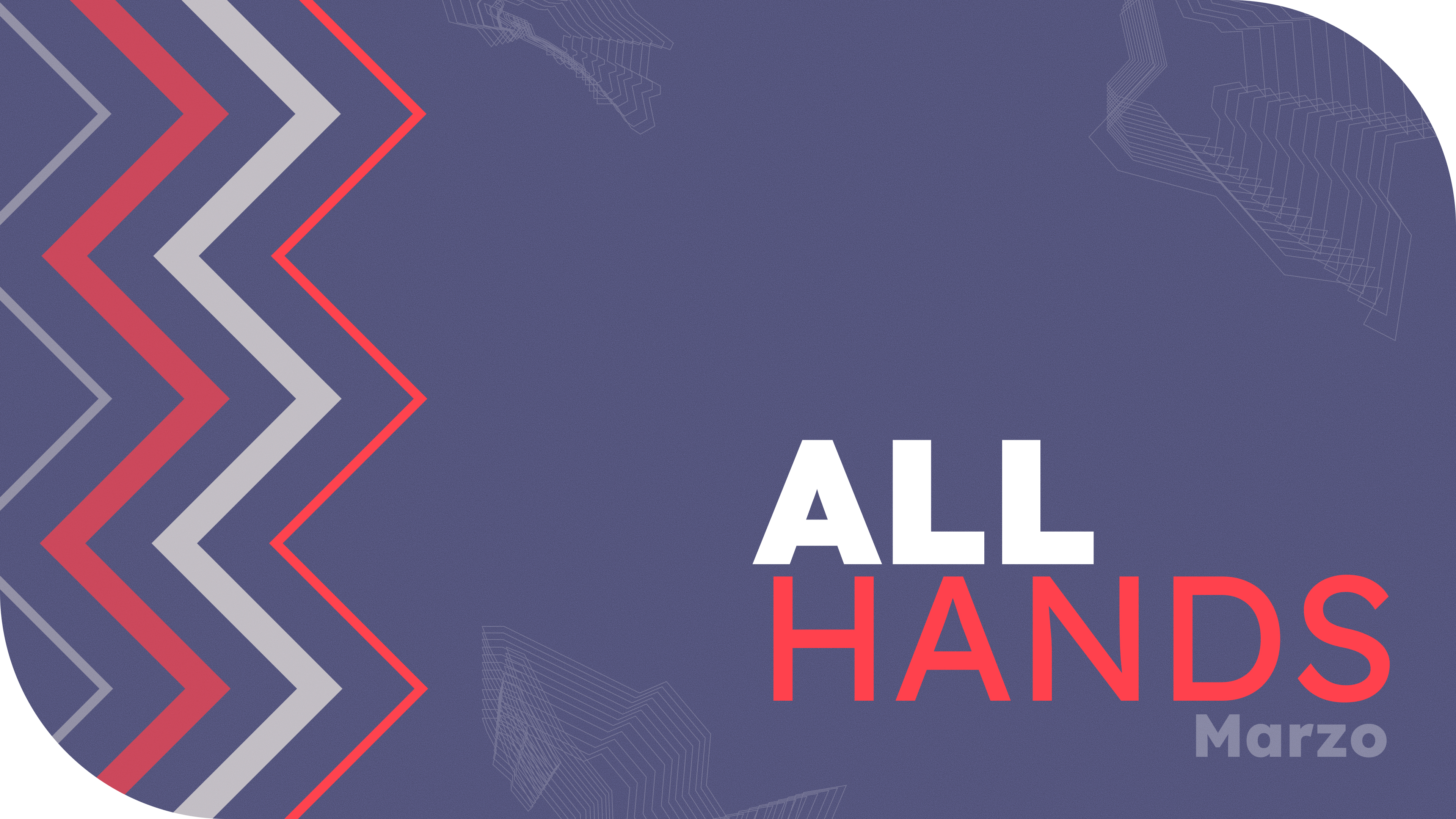
Multiple background options were designed to give the team visual variety without breaking consistency. Each one plays within the same color system and can be paired with any component in the library.
The library was built to give the team creative freedom while keeping a coherent visual language. Anyone on the team could pick components, mix layouts, and build their own slides — with guardrails that ensured nothing drifted too far from the brand.
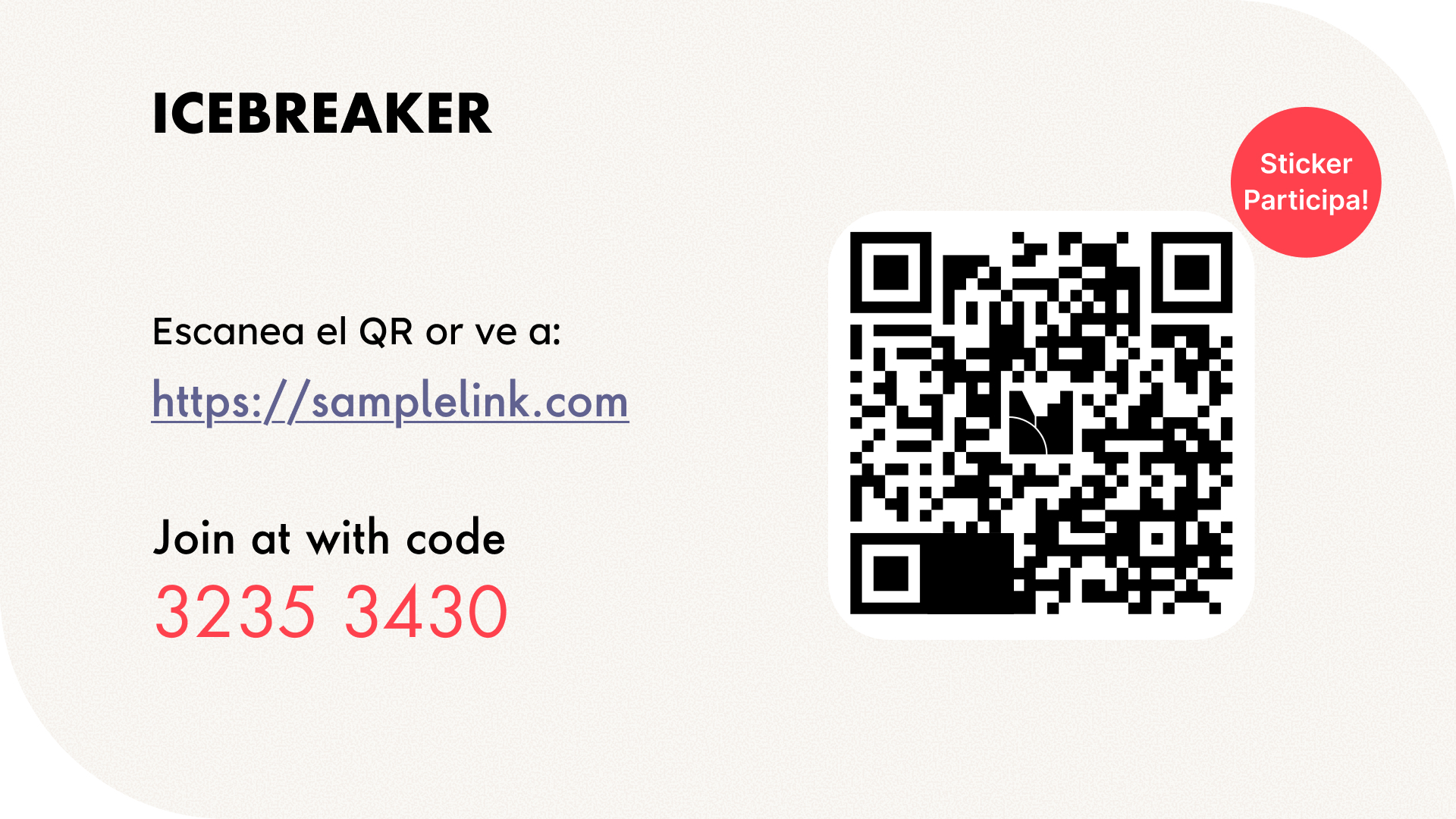
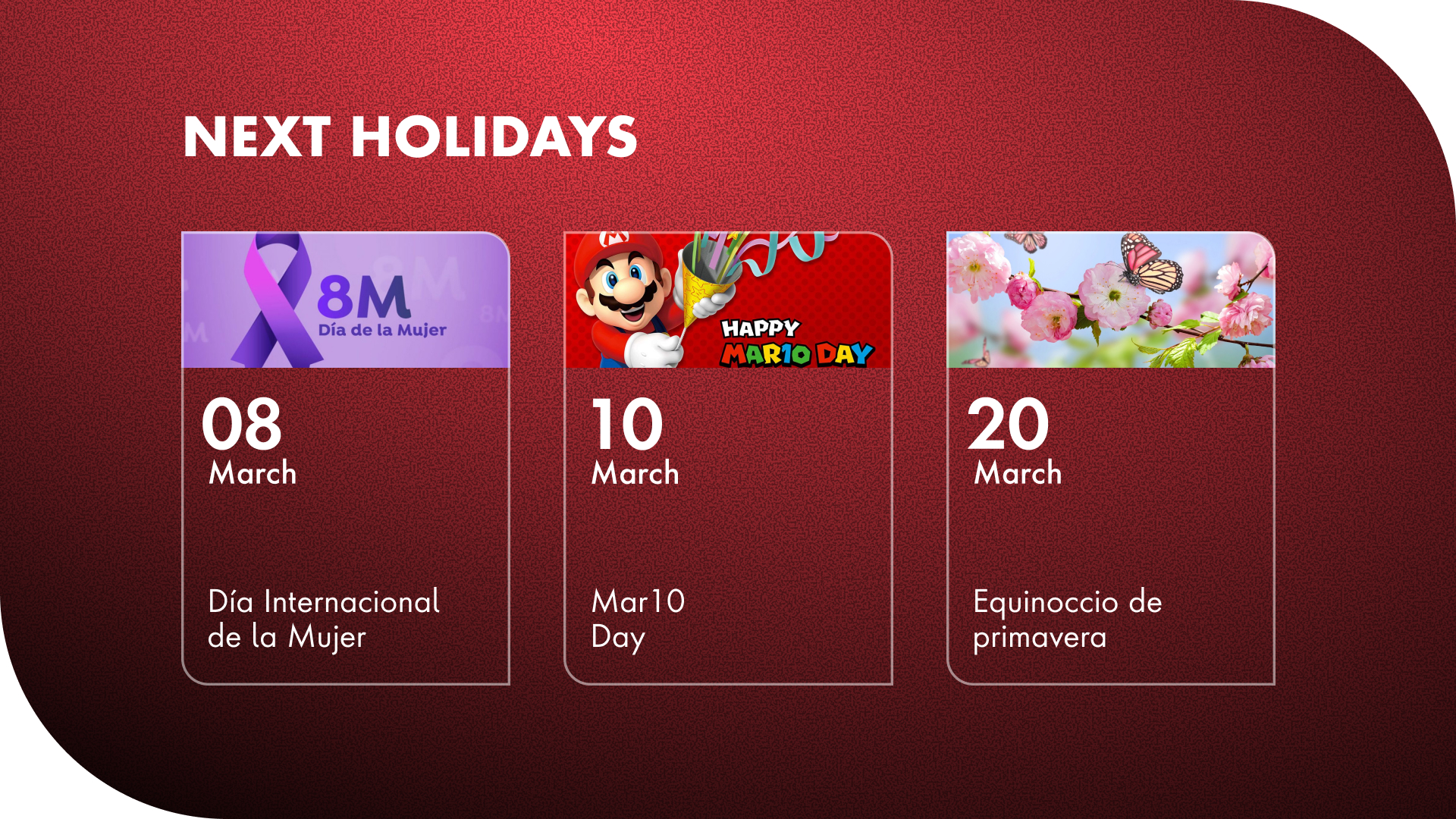
Title cards, content blocks, announcement layouts, dynamic templates — all built as Figma components with variants.
Culturally-grounded vector illustrations, editable in color, size, and text. Designed to add personality without visual noise.
Collaboratively written documentation covering color usage, typography rules, spacing, and do's & don'ts for the whole system.

The style guide was a team effort. It brought together all the decisions made throughout the project into a single reference — so anyone creating slides in the future could do it confidently and consistently, without needing to ask.

Once the library was ready, we needed the team to actually find it — and want to use it. I collaborated on publishing an article on the company's internal content platform, written to inform and invite: what is this, who is it for, and exactly where to find it.
A ready-to-use slide library designed specifically for LATAM all-hands meetings, with a matching style guide for consistent use.
Anyone on the LATAM team who prepares or contributes to monthly meeting presentations — designers and non-designers alike.
Published on the company's internal platform with a direct link to the Figma library and step-by-step instructions to get started.