$1M+ Revenue
on a redesign strategy
Complete redesign of the UP Sí Vale app: From a basic balance-check app to an active marketplace with over 1 million users impacted.
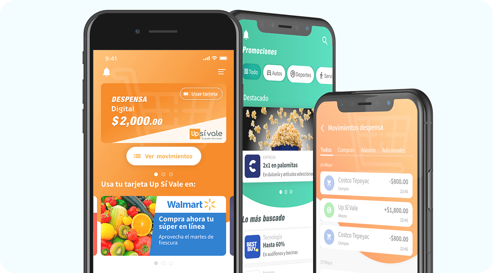
Complete redesign of the UP Sí Vale app: From a basic balance-check app to an active marketplace with over 1 million users impacted.
UP Sí Vale is a Mexican benefits platform serving corporate employees. The app showed balance, transactions, and a benefits section with zero segmentation.
Users accumulated electronic balance without spending it — not because they didn't want to, but because they didn't give them no reason or direction to act. A million potential active users were sitting idle.
We followed a structured process to ensure every design decision on the new strategy design.
Based on the innovation team research we identify two profiles as the main users of our mobile app and design personas for both of them.


We were convinced that we have a great added value and the potential to increase the engagement of the users. The first stop, was interviewing real users and making research qualitative an quantitative. The issues were clear:
They were just checking their balance monthly.
Users didn't know where to spend their money (lack of information).
The design had not recommended good practice of accessibility.
Wire-framing in low and high fidelity, prototypes showing to the stakeholders and feedback sessions framing in low and high and of idea here.


Wireframes in low resolution were fundamental to decide the new architecture information of the app
Prototype for usability test

How the redesign make a better and easier experience for the users.
Track spending and details of their spending in movements
New business and brands when use the app
Promotions for use the digital and physical UP Sí vale cards
Led initiatives to embed UX principles across the organization by introducing Design Thinking workshops and Agile collaboration practices. Increased stakeholder buy-in the design process, resulting in stronger cross-functional alignment and more user-centered product decisions.
Established a design governance committee that connected Product, Technology, and business stakeholders. Improved visibility into design initiatives, standardized design tokens, and ensured consistent implementation of UX standards across multiple teams and projects.