
UX & UI Design – Bitcoin Wallet App
-
Category
User Experience
-
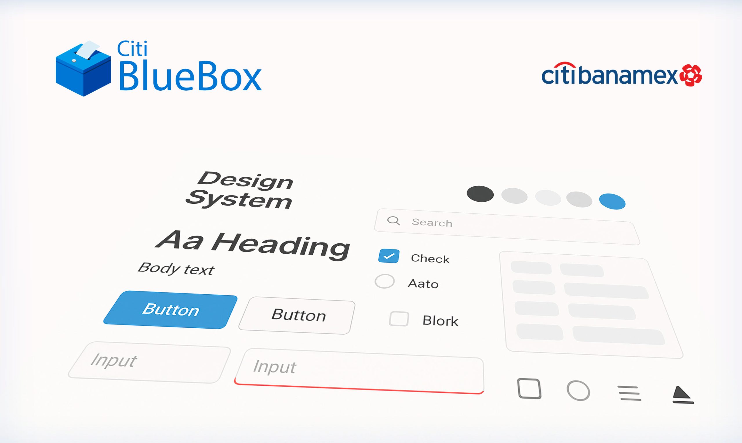
Tools
Figma
Objective
Offer a comprehensive digital system that allows investors to access to their online portfolio, manage the returns and capitalize on their networks.
An online platform accessible from any device connected to internet, corporate interface, solid architecture, its quality being main security and accessibility.
Empathize
For our Bitcoin wallet app, this means immersing ourselves in the financial, emotional, and technological landscape of cryptocurrency users. As UX researchers and designers, we begin by conducting user interviews, contextual inquiries, and ethnographic observations to uncover insights about:
- Trust and security concerns: How do users perceive the safety of digital wallets? What makes them feel in control or vulnerable?
- Technical literacy: What is the user's level of familiarity with blockchain technology, private keys, and wallet recovery processes?
- Goals and motivations: Are users using Bitcoin for investment, daily transactions, remittances, or anonymity? Each use case presents different priorities.
- Pain points: What previous frustrations have they experienced with other crypto wallets. Emotional drivers: How do users feel during key moments—such as sending large transactions or recovering lost access? We use tools such as empathy maps, personas, and journey mapping to synthesize findings. These tools help articulate not just what users say and do, but also what they think and feel—ensuring we design a Bitcoin wallet experience that is secure, intuitive, and aligned with user expectations.
- Ultimately, ensures that the final product is grounded in genuine human needs, not assumptions or technical constraints.


Portfolio