Us, the UX team of Up Sí vale, needed to evaluated the new experience of the redesign we create.
Looking to find and document pain point and areas of growth and new opportunities.
Also we wanted to understand the behavior of the users with the new features and improvements we implement in the launch of the design in the app stores.
What we want to know?
Is the user understanding the brand features?
Can users complete a digital shopping?
Are we going to get different solutions from users feedback?
Who we apply the test?
3 man and 3 women participants, cardholders.
With knowledge of medium / high technology. Also, familiar with the app.
Hypotesis
– Users will know where they can spend their money
– Promo section will be an added and usefull value for users
– The users maybe can get stuck in the online shopping
– Users will be satisfied with “Report card” and “Turn off card” new functions.
Task for users
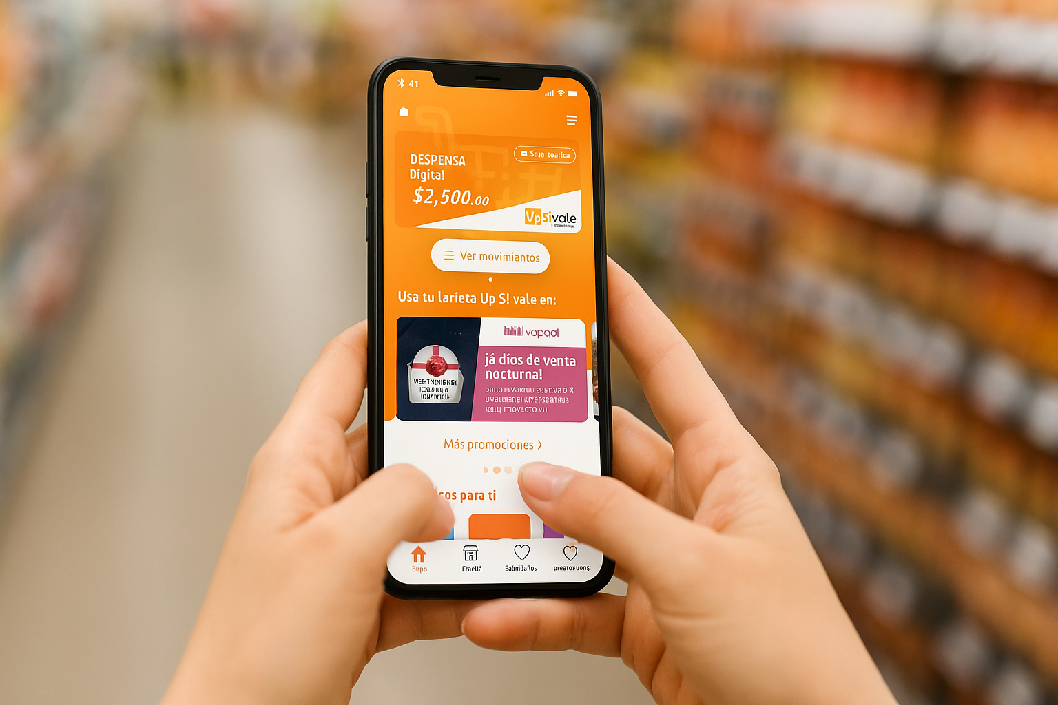
Complete onboarding
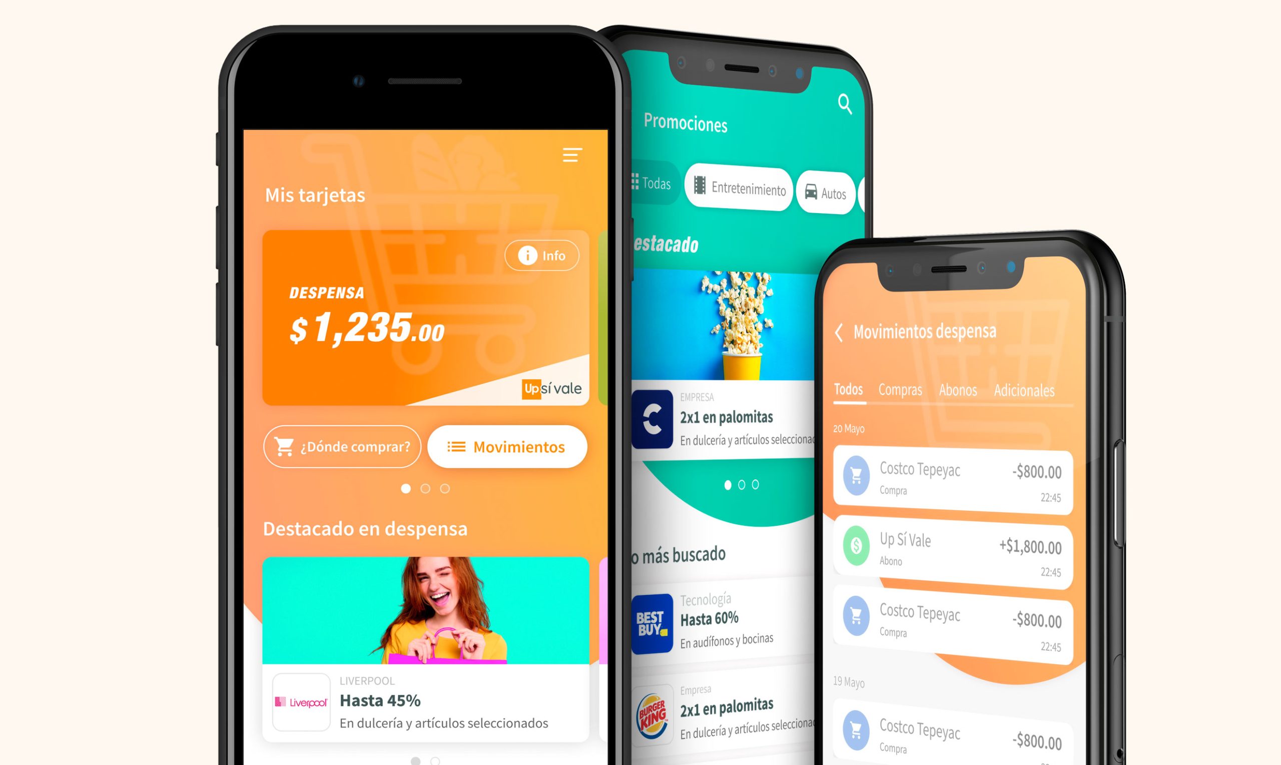
Add a pantry card
Know balance pf cards
Check last movements
Report unknown spend
Catch promos and interact with them
Make a digital purchase
Turn off (block) card
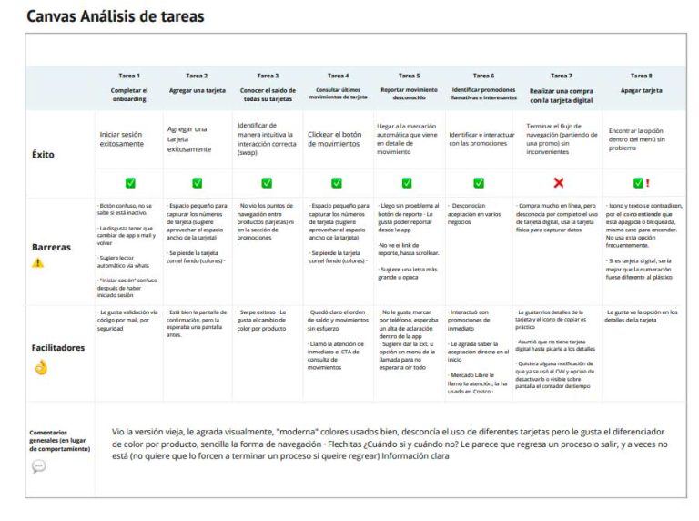
Observation canvas (Research documemntation)
Positive findings
Intuitive and easy interface
Sending code by standard mail (everyone knew the process)
Good dynamic in CVV management, is perceived as very safe
The interaction in the Home is clear
Border on the edges of other cards help to understand that there is more to navigate to the sides
Well placed button, good contrast, clear text
Good that it has the reporting option
It seems useful and safe
Very good dynamic CVV for security
Area for improvement
The buttons are confusing. It’s not clear if they are inactive
Lots of text on welcome screen
Improve code validation (via whatsapp or SMS)
Some accessibility issues in cases with small numbers
Confusion as to why it changed color from white to orange
In some devices the user have to scroll to see the main info